Sample 1
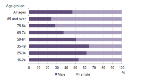
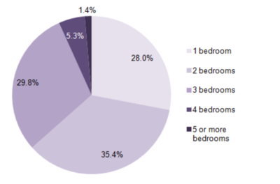
The bar chart below shows the proportions of English men and women of different ages who were living alone in 2011. The pie chart compares the numbers of bedrooms in these one-person households.
- Living alone in England by age and gender, 2011
- Number of bedrooms in one-person households (England, 2011)
-
The two charts give information about single-occupant households in England in the year 2011. The bar chart compares figures for occupants’ age and gender, and the pie chart shows data about the number of bedrooms in these homes.
-
Overall, females made up a higher proportion of people living alone than males, and this difference is particularly noticeable in the older age categories. We can also see that the most common number of bedrooms in a single-occupant home was two.
-
A significant majority of the people aged 65 or over who were living alone in England in 2011 were female. Women made up around 72% of single occupants aged 75 to 84, and 76% of those aged 85 or over. By contrast, among younger adults the figures for males were higher. For example, in the 35-49 age category, men accounted for nearly 65% of people living alone.
-
In the same year, 35.4% of one-person households in England had two bedrooms, while one-bedroom and three-bedroom homes accounted for 28% and 29.8% of the total. Under 7% of single-occupant homes had four or more bedrooms.
Sample 2
-
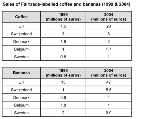
The tables show the amount of money spent on Fairtrade coffee and bananas in two separate years in the UK, Switzerland, Denmark, Belgium and Sweden.
-
It is clear that sales of Fairtrade coffee rose in all five European countries from 1999 to 2004, but sales of Fairtrade bananas only went up in three out of the five countries. Overall, the UK saw by far the highest levels of spending on the two products.
-
In 1999, Switzerland had the highest sales of Fairtrade coffee, at €3 million, while revenue from Fairtrade bananas was highest in the UK, at €15 million. By 2004, however, sales of Fairtrade coffee in the UK had risen to €20 million, and this was over three times higher than Switzerland’s sales figure for Fairtrade coffee in that year. The year 2004 also saw dramatic increases in the money spent on Fairtrade bananas in the UK and Switzerland, with revenues rising by €32 million and €4.5 million respectively.
-
Sales of the two Fairtrade products were far lower in Denmark, Belgium and Sweden. Small increases in sales of Fairtrade coffee can be seen, but revenue remained at €2 million or below in all three countries in both years. Finally, it is noticeable that the money spent on Fairtrade bananas actually fell in Belgium and Sweden.
Sample 3
-
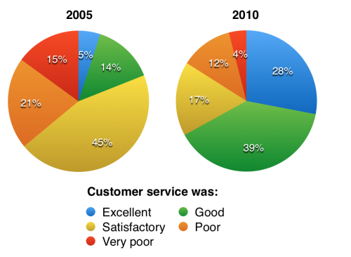
The pie charts compare visitors’ responses to a survey about customer service at the Parkway Hotel in 2005 and in 2010.
-
It is clear that overall customer satisfaction increased considerably from 2005 to 2010. While most hotel guests rated customer service as satisfactory or poor in 2005, a clear majority described the hotel’s service as good or excellent in 2010.
-
Looking at the positive responses first, in 2005 only 5% of the hotel’s visitors rated its customer service as excellent, but this figure rose to 28% in 2010. Furthermore, while only 14% of guests described customer service in the hotel as good in 2005, almost three times as many people gave this rating five years later.
-
With regard to negative feedback, the proportion of guests who considered the hotel’s customer service to be poor fell from 21% in 2005 to only 12% in 2010. Similarly, the proportion of people who thought customer service was very poor dropped from 15% to only 4% over the 5-year period. Finally, a fall in the number of ‘satisfactory’ ratings in 2010 reflects the fact that more people gave positive responses to the survey in that year.
Sample 4
-
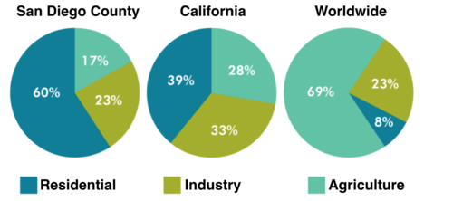
The pie charts give information about the water used for residential, industrial and agricultural purposes in San Diego County, California, and the world as a whole.
-
It is noticeable that more water is consumed by homes than by industry or agriculture in the two American regions. By contrast, agriculture accounts for the vast majority of water used worldwide.
-
In San Diego County and California State, residential water consumption accounts for 60% and 39% of total water usage. By contrast, a mere 8% of the water used globally goes to homes. The opposite trend can be seen when we look at water consumption for agriculture. This accounts for a massive 69% of global water use, but only 17% and 28% of water usage in San Diego and California respectively.
-
Such dramatic differences are not seen when we compare the figures for industrial water use. The same proportion of water (23%) is used by industry in San Diego and worldwide, while the figure for California is 10% higher, at 33%.
Sample 5
-
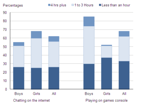
The bar chart compares the time spent by 10 to 15-year-olds in the UK on two activities, namely chatting online and playing computer games.
-
Boys aged between 10 and 15 clearly favour playing on games consoles over chatting online. According to the chart, while 85% of boys play computer games every day, only 55% chat online daily. Furthermore, the majority of boys play on their consoles for more than one hour each day, and 10% do this activity for four hours or more.
-
By contrast, girls prefer chatting online. Close to 70% of 10 to 15-year-old girls engage in online conversation each day, compared to about 50% of this cohort who play computer games. Of the girls who do play on consoles, most of them play for less than an hour, whereas most girls who chat online do so for more than one hour, and nearly 10% chat for four hours or more.
-
Overall, we can see that playing computer games is marginally more popular than chatting on the Internet. However, completely different trends can be seen if we look at the specific figures for boys and girls.
Sample 6
-
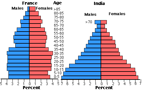
The two charts compare the populations of France and India in terms of age distribution by gender in the year 1984.
-
It is clear that the population of India was younger than that of France in 1984, with a noticeably larger proportion of people aged under 20. France, on the other hand, had a significantly larger percentage of elderly inhabitants.
-
In India, close to 14% of people were aged 5 or under, and each five-year age bracket above this contained an increasingly smaller proportion of the population. France’s population, by contrast, was more evenly distributed across the age ranges, with similar figures (around 7% to 8% of all people) for each five-year cohort between the ages of 0 and 40. Somewhere between 10% and 15% of all French people were aged 70 or older, but the equivalent figure for India was only 2%.
-
Looking more closely at gender, there was a noticeably higher proportion of French women than men in every cohort from age 50 upwards. For example, almost 3% of French 70- to 75-year-olds were women, while just under 2% were men. No significant gender differences can be seen on the Indian population chart.